Native iOS App Dark Mode Feature
My Role: Lead UI Design, Research, Design Iteration
The Product
The Mobile Partner App’s main goal is to keep the loan officer’s business partners aware of their client’s loan within the mortgage loan process. Users can see which milestone their client’s loan is in throughout the loan process, stay in touch with their loan officer, send communications to both clients and loan officer, and much more.
App Users: Real estate agents and builders
Main User Goal: Easily see where clients are within the mortgage loan process
Additional User Goals: Keep in contact with loan officer, quickly share lead information, and use mortgage calculator tools to share reports with clients
The Business Need
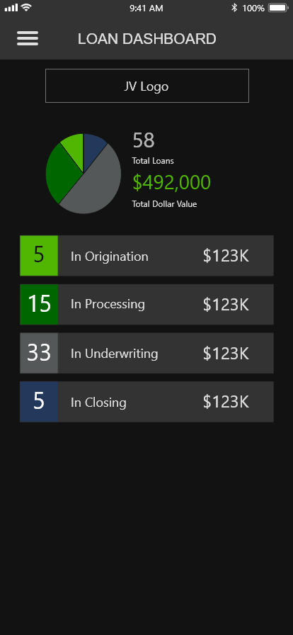
The business need was to update the iOS and Android app by being able to apply either the light mode or dark mode depending on the device settings of the user. Many users have gotten used to dark mode displays on modern apps and want this feature on our app.
Main Project Goal: Create a dark mode version of the app that offers benefits such as reduced eye strain, modernized custom experience, and save device battery life.
The Research
First, I researched industry-leading apps to see the current state of the dark mode offerings. Apps that I saw that excelled in dark-mode display included Twitter, YouTube, Instagram, Pinterest, Gmail, etc. These apps were successful because their dark-mode versions were easy on the eyes and enjoyable to use.
Next, I researched the Apple and Google design guidelines to see their best practices around dark mode design. Google’s Material Design documentation was abundant and was an excellent fit for the app. I leveraged the color recommendations for the dark mode app palette, knowing that a lot of testing had been done to verify the success of the color scheme. I learned that instead of pure white for text color, they leveraged light and medium grays that were much easier on the eyes and thus easier to read.
It was also imperative that ADA guidelines were considered to make this a successful enhancement. As always, I referenced Web Aim’s Color Contrast Checker to ensure all colors had a high enough contrast so all users could easily see the content.
The Design
I standardized the dark-mode version of the components such as the background, container backgrounds, primary and secondary buttons, tab buttons, delete buttons, logo, banners, navigation menu, modals, etc.
As always I presented my design to the team and collected their feedback. This time there was nothing major that concerned the team and I implemented team consensus ideas to improve the design. I was ready to write documentation for the team of product analysts, developers, and QA members to use.
I was able to use three out of the four main brand colors as is, but I had to slightly adjust the lightest blue because its saturation was too high and too hard on the eyes. Starting with the hex code, I adjusted the saturation down a bit by lowering the opacity of the color. From there I found that new hex code by using the eye dropper tool. I wanted the developer to just use all colors at full opacity for easier implementation and maintenance.
The main text paragraph color was a very light gray that was much easier on the eyes than pure white. The background was dark black, but not pure black for easier visibility. The container colors were a charcoal gray that there dark enough to have high enough color contrast for ADA compliance, but light enough to stand out from the background.
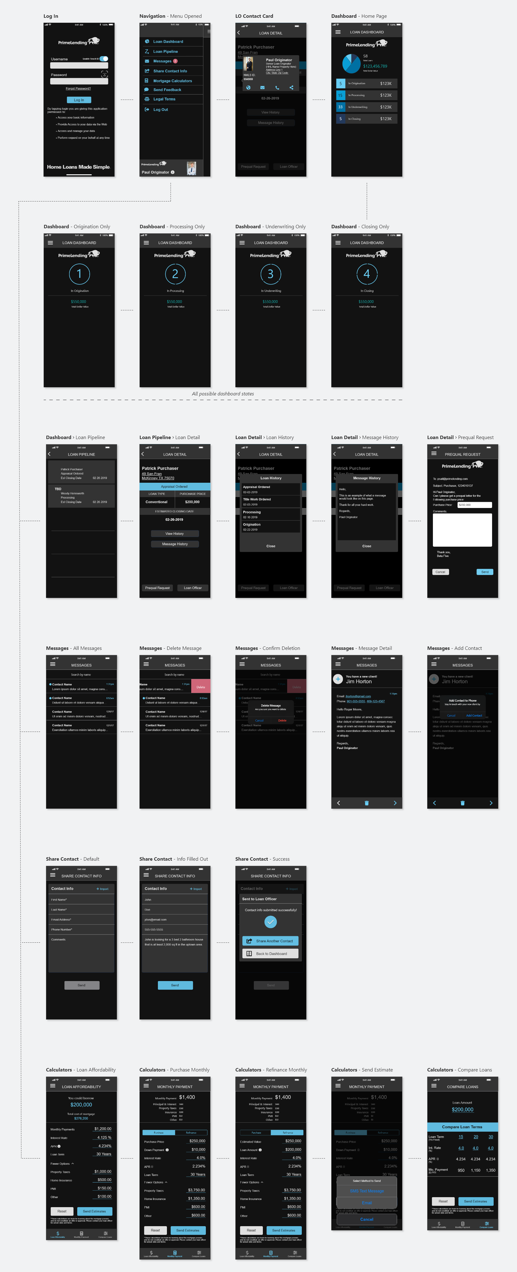
Loan Dashboard - Light Mode

Loan Detail - Light Mode

Loan Dashboard - Dark Mode

Loan Detail - Dark Mode

User Flow
The Design Handoff and Implementation
I created special design documentation with developer notes that broke down the hex codes of the various components. I also gave the colors standard names to make communication much easier when discussing the design. Frequently I would check on the development team to make sure they had everything they needed to minimize inefficiencies while coding.

Dark Mode App Documentation Example
Joint Venture Variation
There was a need for a business joint venture to receive their version of the app. The color scheme was a green theme per their branding guidelines. My job was to ensure that the joint venture version of the dark mode feature was consistent with their branding standards, making it cohesive with the parent brand.

Dark Mode App - Joint Venture Documentation Example
The Result
The end result was a better overall user experience, verified by excellent user feedback. Users enjoyed the option of having the dark mode to match their device settings improving aesthetics, preferences, and battery life. This feature helped keep the app aesthetic modern, industry-standardized, and ADA-compliant.